I’ve designed, illustrated and completed more wedding invitations than I can count. From the time I was a letterpress apprentice, moving my first bit of type around in illustrator, to running my own company and producing elaborate suites for clients of my own, I’ve done it all. I’ve worked on every kind of style, from Art Deco daisies, to Frank Lloyd Wright stained glass, illustrated cute detailed maps, playful cartoons, and written the classic wedding wording over and over, not to mention assembled gate folds, glued liners, and stamped enough wax sealed envelopes for a lifetime. I’m pretty sure that my experience has covered the full spectrum and possibilities of letterpress wedding invitations. While I’m very proud of that diverse body of work, I am most proud and happy with my own wedding invitation, which I see as the culmination of years of design experience wrapped into the simplest of packages.
Most design clients, for whatever reason, believe more is more, so after years of having to fit too many words and images onto a 5×7 inch piece of paper, I decided to rebel against the typical invitation and make something completely for me. I limited myself to using only type – Didot, Futura and Baskerville, if you must know – and pulled design inspiration that was minimal, chic and feminine, which represented both my wedding venue and the event as a whole. Over the years I’d begun to develop my own taste in design, so when it came to the kinds of things I looked for in inspiration, I knew exactly what was right. I put together an inspiration board and got to work.

The Save the Date – which I started with first – took me less than an hour to design. It rolled out of my head and into the Adobe Illustrator file so quickly, I felt like I had barely begun working. It must have been sitting in my thoughts for some time, because it’s rare when a design just flows that easy, without a lot of fuss, especially given the endless possibilities I knew I had available to me. In general, tweaks with the wording always take a little back and forth, but in terms of the layout, it was ready in a flash.
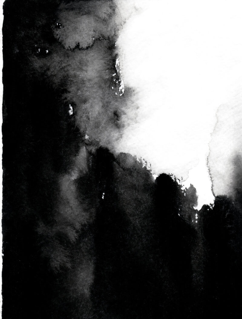
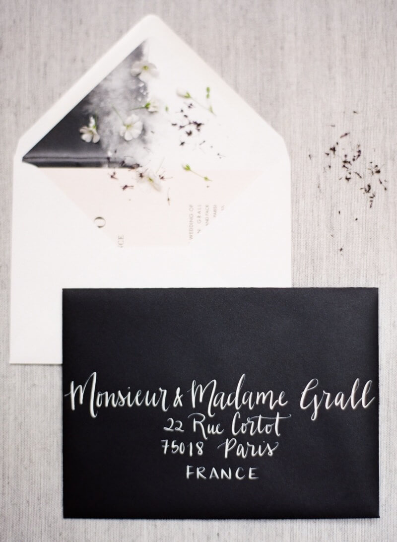
I had already sourced a pink paper I knew would be perfect, and I asked my sister to paint a simple black watercolor design, which I had printed as a contrasting envelope liner. Two weeks later, I printed the design myself with black ink on an antique Heidelberg Windmill press as I’d done for so many brides over years. It took me just a few hours and it would be the last thing I would ever print (soon after I retired my printing business and started this blog!).
The Save the Date set is by far my favorite thing I’ve made and I love how it all came together.

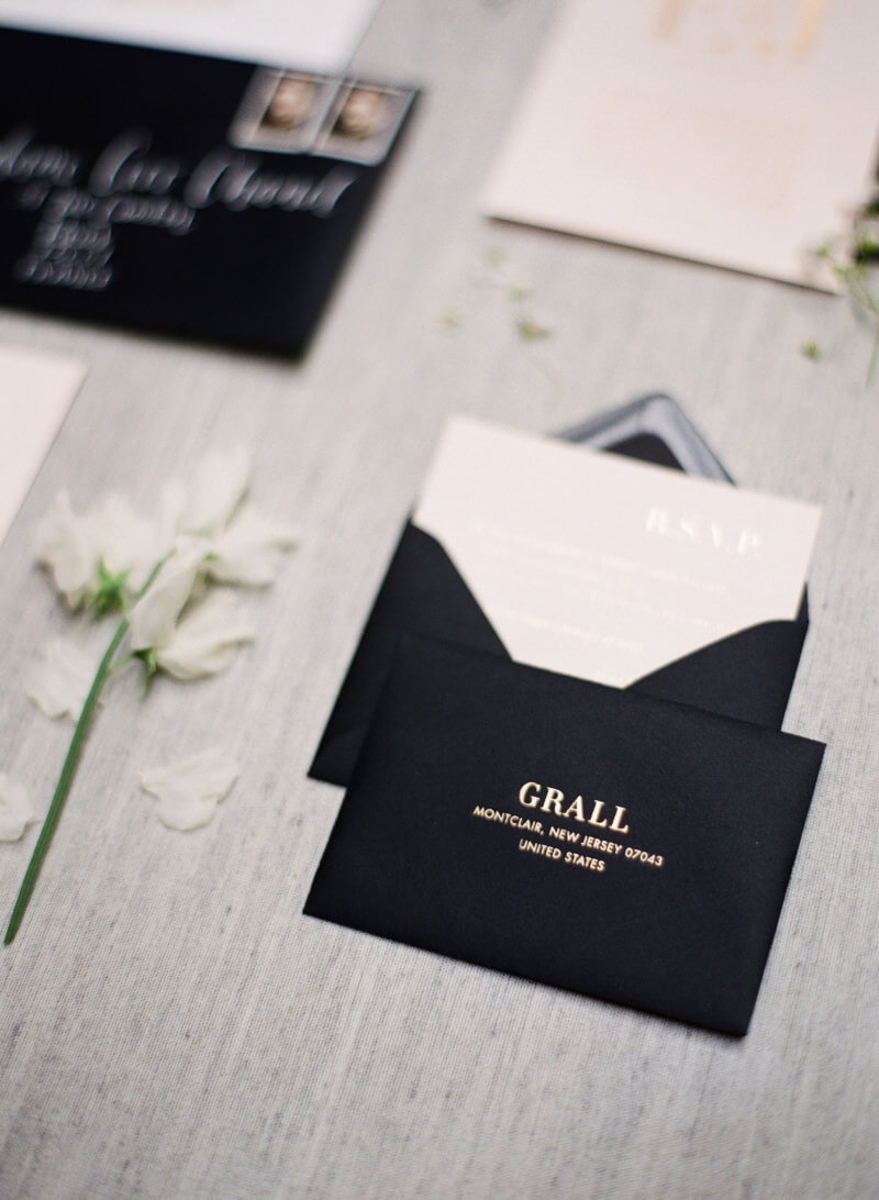
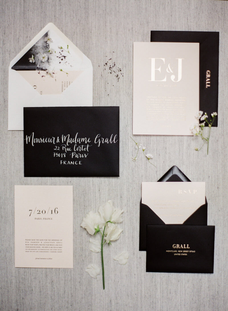
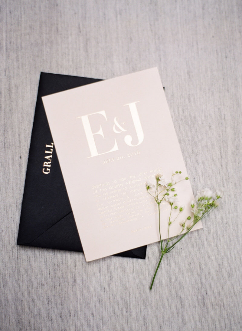
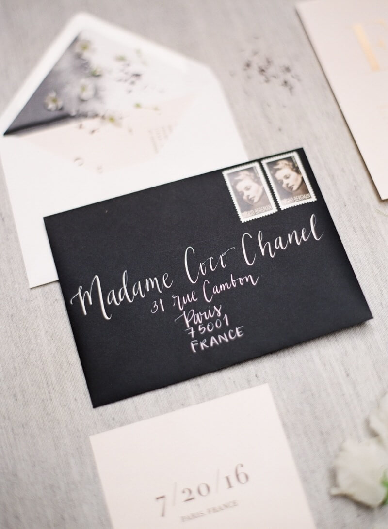
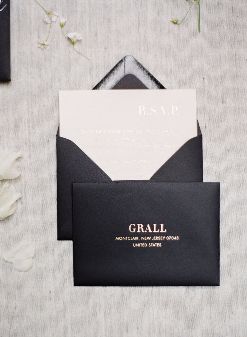
The wedding invitation itself just pulled from the design of the Save the Dates. I thought of doing styles a little more elaborate, but to be honest I ran out of time, wanting to keep it easy on myself and to put my focus in the other important aspects of wedding planning – like staying sane. I decided to print the invitation on the same pink paper, with gold foil, and despite a few objections, went with a black envelope. I love the combination of light pink and black, with a hint of gold – it felt timeless to me and perfect for the setting of our wedding.
Since I’ve done so many invitations, choosing wording was tough. As I experimented with “cordially invited,” and “honored guests,” I decided to toss the whole thing and go with something much less conventional: the words of Willy Wonka and the Chocolate Factory’s famous Golden Ticket! It was fun, a little ridiculous, complimented the sophisticated design and, more importantly, perfectly represented my husband and my personalities.

When we finally got around to printing the suite – my poor local foil printer had to go through countless numbers of rolls to find a gold foil that would work with the type of paper I had chosen. For some reason, despite it being uncoated stock, the foil from many companies would not properly stick to the paper. It’s the kind of thing you don’t usually have to deal with unless you are a designer, but there are so many variables when it comes to letterpress and foil stamping that you may find papers don’t work with certain inks, or colors don’t show up how you thought they would. But once we found a gold that worked, I was really happy with its silvery/platinum tone and it worked great with the pink paper and black envelopes.
I’m so happy with how my wedding suite turned out and excited to finally share these!
Whether you are designing your own invitation, working on a custom suite with a professional, or choosing from among a pre-made set, here are a few of my BIG tips when it comes to wedding invitations – or any other invitation for that matter!
1. Know what you like first. Whether you are working by yourself or with a designer, narrowing down all the options is important to keep yourself from getting overwhelmed. Get online and find examples that really speak to you in terms of color and style, and take your time really considering the options. Be discerning, and don’t choose every kind of invitation under the sun. When a bride would send me a million different designs, I usually turned down the job. It’s a sign that they haven’t done their homework and will have serious trouble making their mind up later!
2. Consider the venue. This is the single most important influence to the design of a wedding invitation. If you’re getting married in a rustic barn, don’t demand a masquerade themed invite. The suite is the first thing your guests ever see about your wedding, so from the start it should set the tone for the whole event and be an introduction of what to expect.
3. There are no rules to wording. Many of my clients insisted on having certain traditional phrases on the invitation, feeling like it was unacceptable to do anything else. But if you’re feeling like expressing yourself and your partner’s personalities, it’s not limited to just the design, but the language too. It’s your party and you can do what you want to!
4. Know what’s important. Letterpress is one of the most beautiful styles of printing, but it is expensive and can be limiting, so I wouldn’t recommend it for everyone. For people interested in good design, without excessive printing costs, I recommend a great, easy site like Minted. For others, like me, who are obsessed with paper and stationery, a custom suite was the only option. However, unless you can make you own, as I was lucky enough to do, it will cost you a pretty bundle. Be sure it’s what you want and that you are okay spending the money on it.
5. Have fun! What could be better than celebrating? Invitations should get you excited and happy for your event, not bogged down, so forgo the ridiculous packages of rose petals and boxed invitations atop sand – it’ll makes you crazy. Just be yourself, explore your creativity, and have fun!
And now that I’ve shared a little bit of my past career as a designer and letterpress printer, I think She’s So Bright could do with a little custom letterpress stationery…any ideas?
What did you decide for your own wedding invitations, or do you have a style that you’d love to try when the time comes? Share your thoughts and tips with my readers below! For more photos from the wedding, click here. And special thanks to my wedding photographer Greg Finck for the photos!